

It’s always weird to talk about “Sarah Burk” the brand vs “Sarah Burk” the person. That’s what I get for using my own name as my business name, I suppose. Awkward linguistics aside, I’m pumped to introduce you to the brand new Sarah Burk website! (And overall new brand, as well.)
This rebrand has been consuming at least 50% of my brain space for the last 4+ months, so it’s only natural to spill out my mental guts and let you in on the process. Sound good?
Why I Rebranded My Business
When I launched my website a year and a half ago, I didn’t expect to be craving a change so soon. I had made the big switch from Squarespace to Showit and finally had a website that actually represented the level I was at in business.
Kind of.
Don’t get me wrong, I loved her! I was so proud! She looked damn good for being 100% DIY with the barest hint of a template bone structure.
But she was still giving very much DIY.
After months of looking at the same pages giving me the same grief, there were things I knew I wanted changed but didn’t have the skills or bandwidth to implement them. (Looking at you, blog page…)
So at the beginning of 2024, after looking over my business expenses from the past year, I realized I had some money to burn, so to speak. And I made my first two big hires in my business —
Peach Perfect Financials for my taxes and bookkeeping. (That’s a story for another time!)
And Sarah Kleist for my website design.
I swear I don’t only work with people who have the same name as me. But it does make it fun.
I can — and will — sing Sarah’s praises for hours, and she was the obvious choice when I knew I wanted to revamp my website.
Okay, but you changed more than just your website…
Darn tootin’ I did! You think I’m going to redo my website and not change my brand?
My “brand” started as a color palette from Coolors and my favorite Canva fonts in 2020. The only reason you could even call it a brand was because I didn’t change it.
But I was dying for something new. Something more elevated that fit me better than my current choices.
To keep it short and sweet, here are all the things that got revamped during this rebranding process:
- Branding (fonts and color palette)
- Website design
- Website copy
- Lead magnets
- Email sequences
- Email design
We all but burned the old Sarah Burk to the ground and started building from the ashes.
Those are the technical details, but what I really want to get into is the ~why~ of it all. Not just why I rebranded, but what those choices meant and what guided them.
The Rebranding Strategy
I’m going to be so for real with you right now. I had never sat down and actually conceptualized my brand strategy beyond a few jotted down notes until I started this website project.
To quote the brand strategy questionnaire I filled out for Sarah Kleist, “This is where you learn I’ve skipped all the beginning business steps and don’t have a detailed ICA hahaha”.
Despite that fact, I realized I kind of did know what my brand was, even if I had never written it out. And now, I have a visual brand identity and online home (website) that embodies that brand.
I’m going to share a few other snippets from the questionnaire so you can see more of what guided this rebrand and so you can hopefully see it in the new website as well!
Adjectives I want people to associate with my brand:
- Trustworthy
- Comforting / safe
- Friendly
On relating to my ideal client:
“We relate in the sense of wanting to build a business that is fun and free. Of making enough money to support all our wildest dreams.
“We’re not trying to build a girlboss agency, but we’re willing to put in the work to be ridiculously successful.
“There’s a shared sense of realness, too. There’s no posturing or pretending we have our shit together.”
The overall feeling I want people to get from my brand + website:
“I want them to feel validated, seen, and supported in a way that’s both calm and fun.
“Like the mutual comfortable silence when you’re just hanging out with your best friend. You know you can be chill together and that they’ll also hype you up for whatever wild idea you have next.
“I want them to feel like “oh she GETS me” and be excited by that.”
And then my favorite question of all is when Sarah asked me to envision if my brand had a physical storefront, what the vibes would be.
My brand in physical form:
“It would 100% be a bookstore/cafe combo. Walking in instantly feels safe and warm, like coming home.
“It’s not minimal, but intentionally crowded, collected, inspiring, discovering, and wandering, but also with pockets of space to breathe.
“Warm tones, wood floors, lots of light. Some folk indie song you think you might have heard once is playing softly in the background. It smells like book pages and pine and freshly brewed coffee but there’s a hint of something sharp, maybe spicy or citrusy. It’s not all soft and warm, there’s layers.
“It would be located on the corner of a small street in London.”
There are a few specific places in real life that definitely inspired this sketch: Shakespeare and Company in Paris, Daunt Books in London, and this one bakery in Stockholm.
The English major in me definitely popped out a bit on that one…
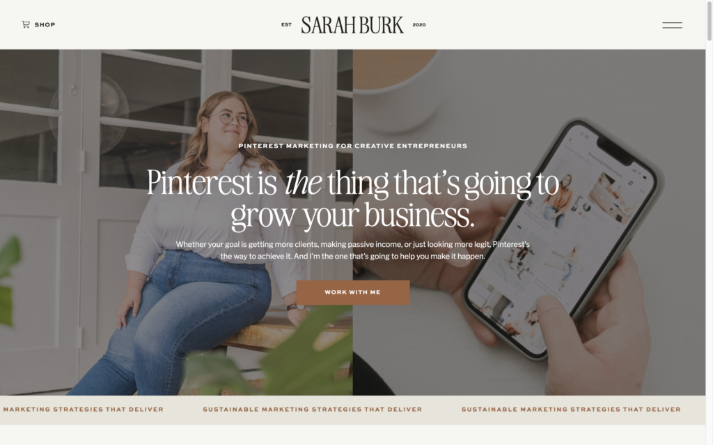
The Website Details
The Design
We started with this gorgeous template from Northfolk, which Sarah customized and turned into my literal dream website.
It would be impossible to pick one single favorite part of the website, but I’ll share a few of my top contenders.
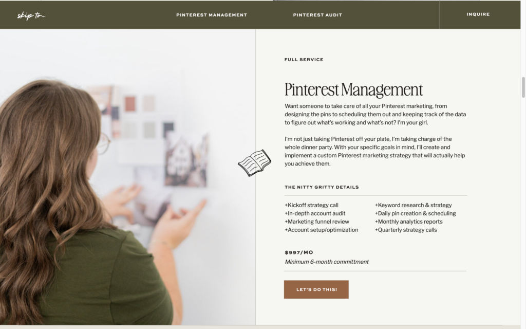
The navigation on my Services page:
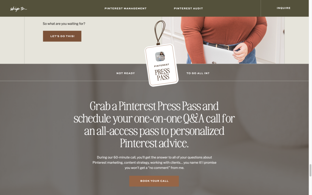
The custom “Press Pass” icon:
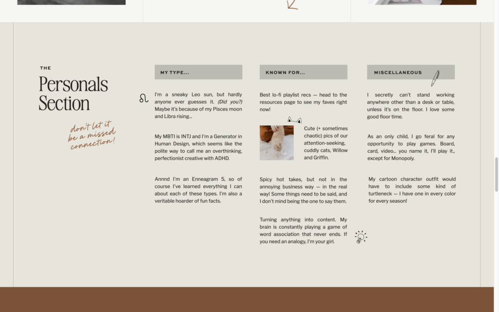
The Personals section on my About page:
A Blog page I actually like:

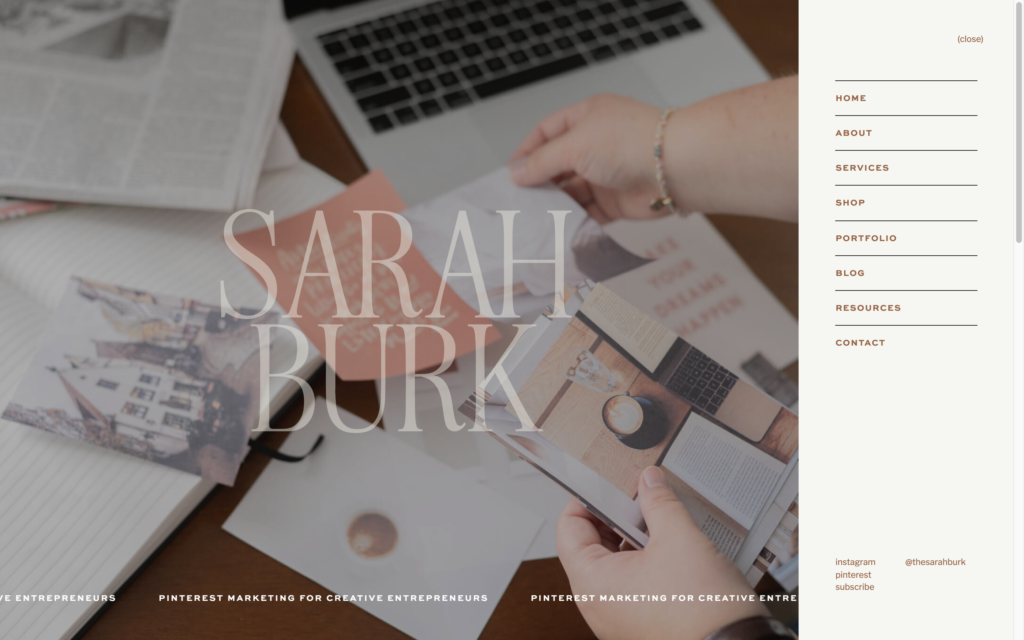
This absolutely stunning navigation menu:
The cool ass portfolio moment on my Home page:
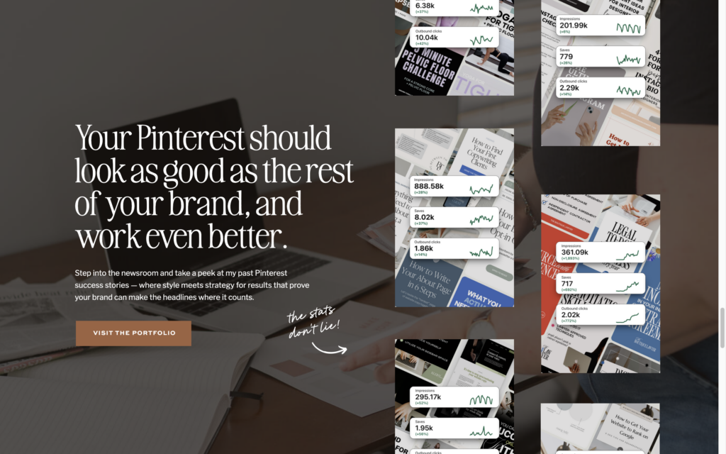
And overall how she used almost exclusively my own brand photos, which I would’ve never thought to do or known how to make work:
The Copy
I owe every single word on this website to the genius that is Between the Lines Copy’s Site Series®.
It is seriously the best copywriting course (and best course in general) I’ve ever seen. If you like the words I write, you need to go learn from Sara.
This was my second time going through Site Series and my first time going through the updated Site Series 2.0. When I tell you it’s everything you need, I mean it.
A lot of the website copy from my previous website stayed the same, but a fair bit of it changed. Primarily, I wanted to move away from the “time freedom” messaging that was dominating the previous iteration of my copy.
Now, I think the website reads a lot less “change your life” girlboss-y and more authentic to me and my brand. Let me know what you think, though.
The Email Marketing
When I booked my website project with Sarah Kleist, I also added in a Flodesk design day to get my emails customized with my new brand.
Could I have made branded email templates myself? Yeah. Totally.
But I’ve been using Flodesk for 3 years now and haven’t even approached the idea of a template. So the likelihood that I would do it now was slim.
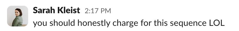
With the emails’ design getting an overhaul, I decided to go all in and revamp all of my email marketing assets, including new lead magnets, updating old lead magnets, brand new welcome sequences, and more.
And dare I say? I popped off with them. Luckily, I’m not the only one who thinks so.
I’m trying my darndest to enter the Big Girl era of my marketing. The one where I don’t completely half-ass things and maybe consider at least a little bit of strategy behind what I do.
We’re not going for perfection here. I’m still a messy marketer at my core.
But these new flows, armed with impeccable design, are a work of love and art.
The other labor of love from this project?
The Pinterest Shop
The biggest update to my brand beyond the new brand and website itself is the fact that I’m now the proud owner of a digital storefront. That’s right, she’s gone passive baby!!!
(JK you know how I feel about the concept of passive income.)
Let me introduce you to… The Newsstand! Your go-to corner store for Pinterest marketing resources.
You can find everything from pin templates and keyword banks to workshops, trainings, and maybe even courses???
The amount of hours I spent in Thrivecart and Flodesk and Canva (and Notion and Airtable and Google Sheets) to get these created and delivered is… honestly scary. But it was WORTH it. I know these resources are damn good, and I’m proud they exist.
You can shop the full collection here!
My Takeaways from the Rebranding Process
Redoing your brand from the ground up isn’t for the weak. Despite having (most) of my copy written before our scheduled Website in a Week timeline in April, you can see that it’s now the end of August and I’m just finally launching.
But it was worth all of that time to have everything done and done right.
I can’t wait for you to explore the new site and all the fun little details. Love you lots & thanks for joining this new era of Sarah!
Website + Flodesk Design: Sarah Kleist
Showit Template: Northfolk (get 15% off w code “SARAHB”!)
Website Copy: Me, thanks to BTL Copy’s Site Series®
Brand Photography: Madalyn Yates
Stock Photography: Haute Stock (get 15% off w this link!)


")

