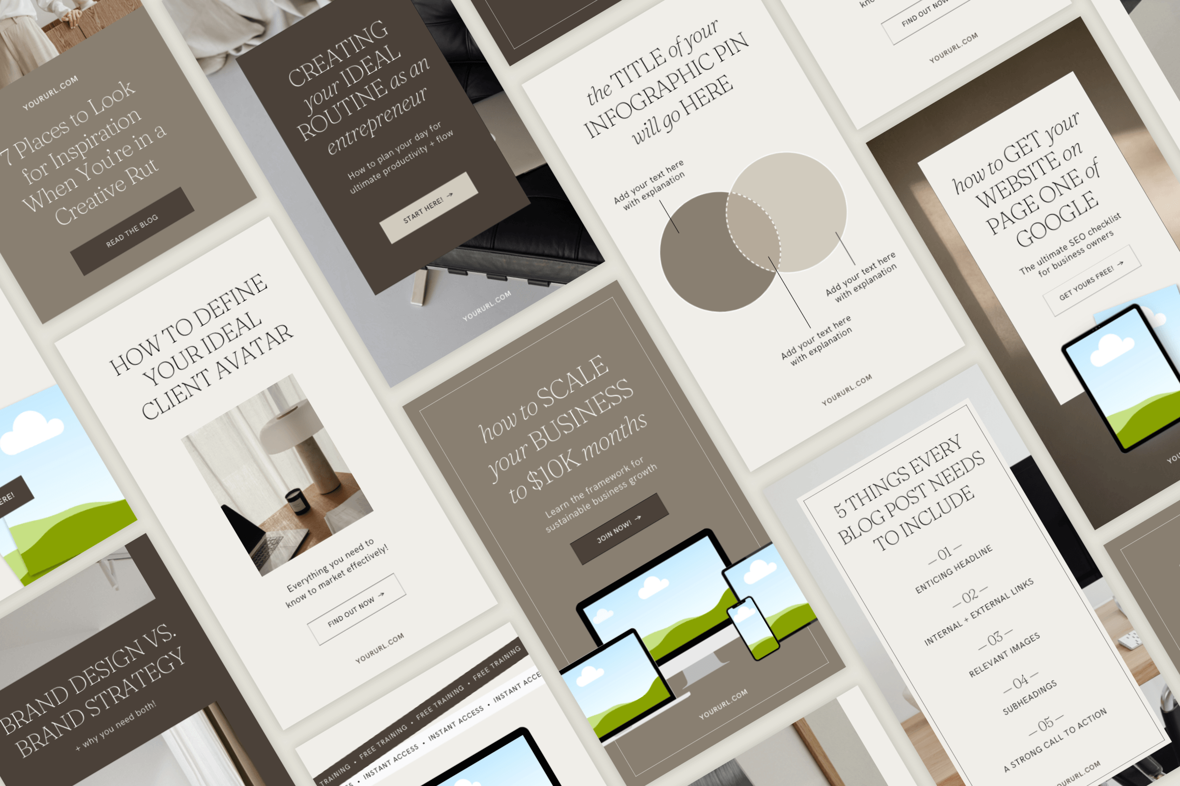
When we talk about types of pins on Pinterest, there are two different things to consider — the pin format itself (standard, video, etc.) and the style of pin graphic you might create.
In this blog post, let’s focus on the different Pinterest pin graphic styles and how to incorporate them into your Pinterest marketing strategy.
If you want a refresher on the types of pin formats, head to this blog first.
Why should you use different types of pin graphics?
Before we get into the different pin graphic styles I recommend, you might be wondering why you should bother with them in the first place.
It might seem simpler to create one pin template to rinse and repeat across all your content. And while yes, that might be simpler, it won’t be as effective. It’s all about finding the balance between simplicity and results.
Different pin graphic styles serve different purposes in your Pinterest marketing strategy.
No two pins are created equally. For example, some designs are better for driving traffic, while others encourage more saves.
If you’re trying to encourage lead magnet opt-ins, you might want to highlight the product itself in the pin graphic.
There isn’t inherently one style of Pinterest pin graphic that is The Best. Different styles will produce different results, and successful Pinterest marketing incorporates all of them.
Using a variety of different pin graphics with different design styles helps make your content more visually interesting.
Although hardly any Pinterest user will be scrolling down your profile analyzing your design with a magnifying glass, it would look quite repetitive if they saw the same image with different titles over and over again.
Varying your Pinterest pin graphics will attract a wider audience.
What appeals to one Pinterest user might not appeal to the next.
Pinterest is all about experimentation and testing different things to 1) see what works and 2) attract different segments of your audience.
Just as the different pin graphic styles serve different strategic purposes for your marketing, they also function as a testing ground to call in your target audience.
5 Pinterest Pin Graphic Styles to Try
1. Blog Post Cover Images
This type of pin graphic is the most common and “expected” Pinterest pin. I call them blog post cover images because that’s typically how they’re used, but this style of graphic doesn’t have to just be used for blog posts.
The blog cover graphic usually features an image with a text overlay. If you picture a generic Pinterest pin, I bet you’re picturing something like this.
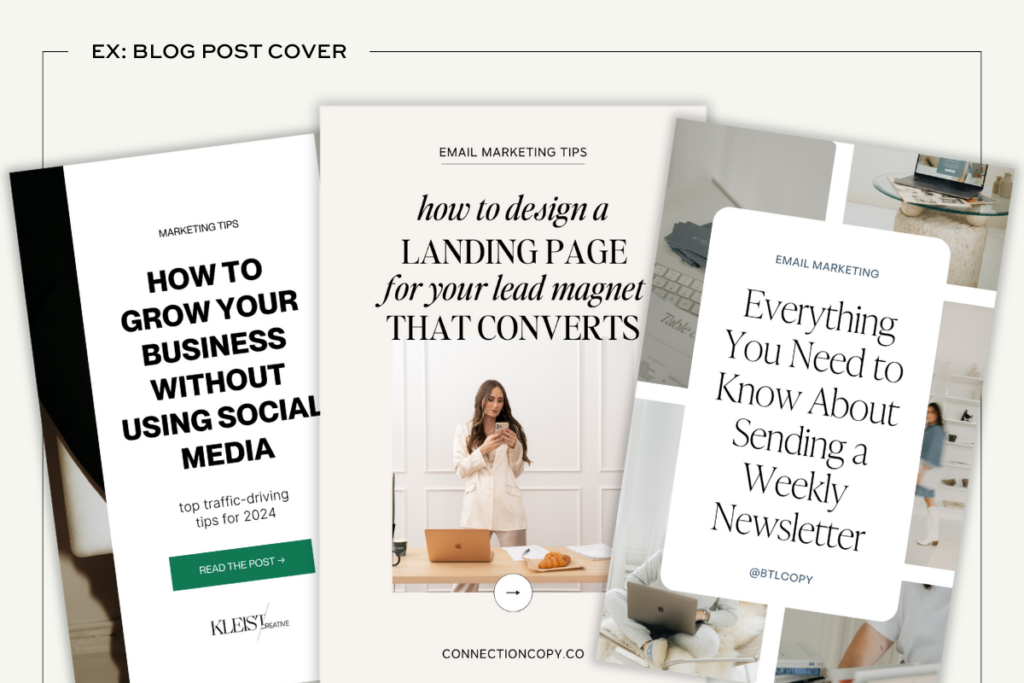
You could also call this pin graphic style a “teaser” or “promo” graphic because it’s not giving away all the information in the pin itself. Typically, these pins will have an eye-catching title that entices users to click for more information.
The primary purpose of blog post cover image pins is to drive traffic to your website. Users want to know they’ll get more detail if they click, so make sure you follow through!
2. Infographic Pins
This pin graphic type and the next are fairly similar in their purpose and function, but they have enough key differences to warrant separate explanations. First up, infographic-style pins.
Infographics are a crucial part of your Pinterest content strategy, and one that’s commonly overlooked, especially for creative entrepreneurs.
You might be used to seeing infographics as you browse for yourself on Pinterest, but you might not have applied this design style to your own content. If that’s the case, you’re missing out.
Infographic pins can take a variety of different formats. It might be a checklist, flow chart, list, Venn diagram, you name it!
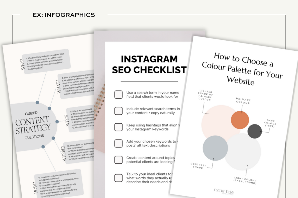
The distinguishing feature of an infographic pin is that it contains value for the user within the pin graphic itself. Unlike a blog cover pin graphic, users don’t have to click through to your website to gain something from the image.
While you might think this is contradictory if your goal is to drive traffic, I promise it’s an important part of the Pinterest success equation.
What makes infographics (and quotes, coming up next) particularly valuable is that they frequently get a lot more saves than blog post cover images.
Pinterest users know the graphic is valuable, but maybe they don’t have time to digest the info right that second, so they save it to their board.
And when it comes to the Pinterest algorithm, saves are an important signal that your content is valuable and should be more widely distributed.
Shorthand? Saves are important, and infographics get more saves.
3. Quote Pin Graphics
I might have said infographic-style pins were the bread and butter of Pinterest, but if I really think about the entire history of Pinterest, there’s no more pervasive style of pin graphic than the quote pin.
You’ve seen them a thousand times — motivational or meme-worthy, on a plain background or maybe a stock image with a nauseating amount of bokeh, quotes reign supreme on Pinterest.
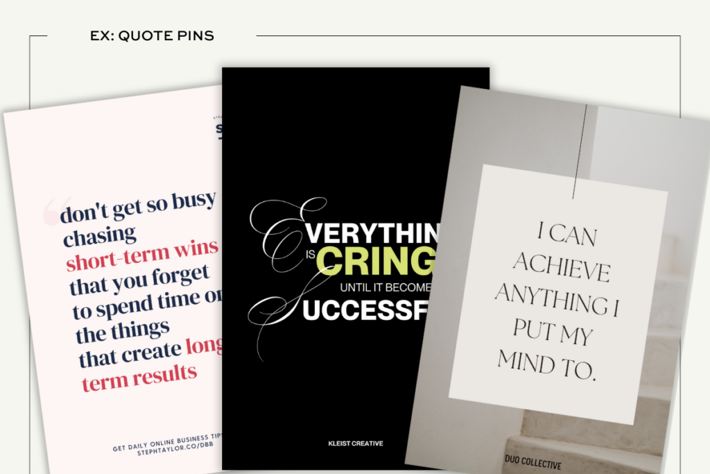
Just like infographics, quote pins typically get more saves. However, that doesn’t mean you have to create random inspirational quote graphics to succeed on Pinterest.
For most of my Pinterest marketing clients, I only create quote pins when it makes sense.
As an example, if a client has a super quotable or inspiring snippet from a blog post they wrote or a podcast they were featured on, I might grab that quote and create a pin with it.
But I’m not going to try and force a quote pin graphic from every piece of content we publish.
4. Portfolio Pin Graphics
If you work in any kind of creative or design field, portfolio pin graphics are going to be a necessary addition to your Pinterest marketing strategy.
These types of pins can be created in a bunch of different styles, but the overall premise is the same. You’re showing off your work.
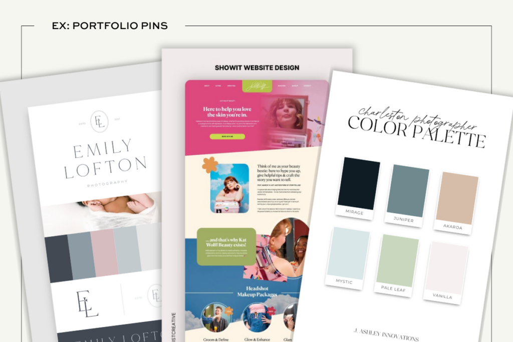
Similar to the way quick win pin graphics like infographics and quotes get a lot of saves, portfolio pins often get more saves than they do clicks.
Pinterest users are browsing for inspiration and are quick to save your gorgeous project to a board, but they might not take that next step and click through to your website.
Again, you might ask: “So what’s the point?!”
The point is brand awareness.
The more your Pinterest audience saves and engages with your portfolio pins, the more they’ll be shown your other pin content. And after they’re done collecting inspiration, they might go back through their inspo board and realize “Hey, I’ve saved a lot of pins from this one designer… maybe I should check them out!”
Boom. You’ve just made a connection with a potential client without even interacting with them 1:1.
As a creative business owner, creating pins from your portfolio content is just too good of an opportunity to pass up. You’re already creating the content as work for your clients, so why not take the extra step and put it on Pinterest?
5. Product Promo Pins
Important: These are different from “Product Pins,” which are rich pin formatted pins typically automatically published through a connected catalog.
Product pin graphics are what I call any type of pin that is clearly and directly promoting some kind of product. What that product is doesn’t matter. We could be talking about a free lead magnet, a digital product, a webinar, course, whatever!
The biggest difference between this pin graphic style and the others is that we’re putting the “product” of it all front and center.
Typically, these pin graphics will feature a mockup to demonstrate the format of the product and make it instantly evident to Pinterest users what’s waiting for them on the other side of a click.
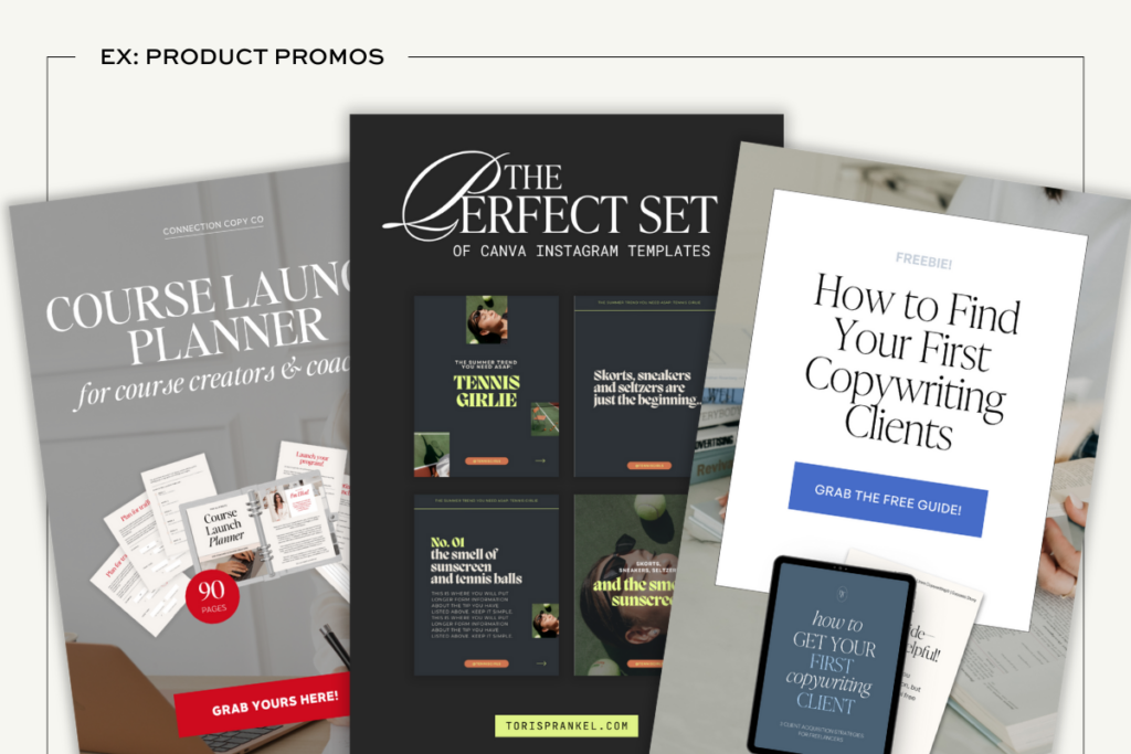
Depending on what type of product you’re creating these pin graphics for, you might want to emphasize some features over others. For example, if it’s a free lead magnet, make sure you mention that it’s free! People love free things!
The main purpose of this style of pin graphic is to encourage Pinterest users to click through to your website and take action by opting in or purchasing.
Best Practices for Pinterest Pin Graphics
No matter what type of pin graphic you’re creating, there are a few basic best practices to follow!
Use legible fonts and text layouts
Your pin graphic will be the first thing that catches a user’s eye while they’re scrolling Pinterest, so you need to make sure it stands out and is clear.
Use larger font sizes, make sure there’s enough contrast between your font color and background, and avoid any complex script fonts (at least for any of the important words).
Include your brand name or URL on the pin
We’re always targeting increased brand awareness when marketing on Pinterest. Including your logo, brand name, and/or URL will help with that!
It also helps in the unlikely event that your graphic gets stolen or reposted without the link to your website. Then, users will know who the image belonged to in the first place.
Encourage users to take action in your pin graphics
That’s right, we’re talking about calls to action! You should be including a CTA in all of your pin graphics, even if it’s just a simple “learn more here”. If you wanna take it up a notch, swipe some of these Pinterest calls to action.
Where you can get really extra with your pin graphic CTAs is when it comes to infographic pins. Although their primary purpose is to increase the amount of saves your content gets, that doesn’t mean we can’t try and get that traffic up, too!
At the bottom of your infographic, where you might include your URL, add an extra bit of text that prompts the user to click through for more value.
In my opinion, this is the best way to use saveable pin graphic styles in your Pinterest strategy. A quick win in the graphic itself encourages saves, but then users know they can find even more value and detailed information if they choose to click through to your website!
How to Use the Different Pin Graphic Styles in Your Pinterest Strategy
There isn’t a magic formula I can give you to guarantee success with these different pin graphics. While I’d love to be able to say “create 5 blog post covers, 2 infographics, and 1 product pin” and have that be it, that’s not how Pinterest works!
Every business is going to be different, even if it’s the same industry and same target audience. What you pin is going to depend on your goals, what content you have available, and how you set up your workflow.
Despite this, there are some overall recommendations I can give you as a starting point!
Balance the types of pin graphic styles you create
You don’t necessarily want to be pinning just blog covers or just infographics or just products or… you get the idea.
Where the different pin graphic styles really benefit your Pinterest marketing efforts is when you’re using all of them.
Some members of your audience might be ready to buy from just seeing that product pin, but others might want to engage with some of your blog posts and free content first. If you’re only pinning one type or the other, you might miss out on attracting that section of your audience.
Create more infographics than you would think
This is something I have to remind myself of, too. It’s easy to get into a habit of just creating more blog post cover style pin graphics, but don’t underestimate the value of a saveable infographic pin!
As a rule of thumb, I try to create at least one infographic-style pin for every blog post I’m working on. If the blog isn’t suited to any kind of graphic layout, I won’t stress about it! It’s much more important to make sure the graphic makes sense for the content than to try and create an infographic just because I said so.
Creating a variety of different pin graphics is the easiest way to stretch your content further on Pinterest
At the end of the day, this is one of the biggest perks to using these different pin graphic styles. Pinterest is constantly asking for more content, but we only have so many hours in the day to work with.
By using different types of pin graphics and creating multiple fresh pins for every piece of content, you can satisfy the Pinterest content machine without having to blog your life away.
And if the idea of designing all these pins has you stressed out, let me be the first to reassure you — you do not have to be a designer to design good Pinterest pin graphics.
There are so many templates available to give you a head start on your pin graphics. Find several that you like, customize them to your brand fonts and colors, and turn them into your own personal brand templates!
Not sure where to start? Check out the Canva pin templates in the Newsstand! With 5 different unique styles to choose from, each pin template pack has templates for all of these different styles of pin graphics.
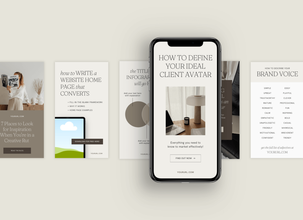
You can also find great template options on Creative Market, Etsy, and Canva!
