If you want to grow your email list, you probably need a lead magnet. And — at the risk of sounding like the beloved children’s book If You Give a Mouse a Cookie — if you have a lead magnet, you need a landing page for that lead magnet.
Lead magnet landing page, opt-in page, lead capture page… whatever you want to call it, you need some way for your audience to opt-in to your list. If your goal is to market your lead magnet on Pinterest, the best option is a landing page hosted on your own website.
In this post, I’m breaking down why your lead magnet landing page is so important, why creating a landing page on your website is essential for growing your list with Pinterest, and what exactly to include in that lead magnet landing page for maximum conversion and subscriber growth.
What is a landing page?
A landing page is a single web page with a specific purpose. They’re often used in advertising campaigns to capture leads or make sales. Typically, landing pages aren’t linked to a business’s main website, as they’re intended to keep users on that specific page until they take the desired action.
While you could create this kind of landing page for your lead magnets, I recommend a bit of a different approach. We’re focusing mainly on organic Pinterest marketing efforts here, so we don’t have to be as limited in our goals.
A lead magnet landing page for Pinterest will give your website visitors a way to opt-in for the lead magnet and explain a little more about what the lead magnet actually is.
Why do you need a specific lead magnet landing page?
With the breadth of opt-in options from email service providers, you might be wondering what’s the point in creating a separate landing page at all. Maybe you have your lead magnet opt-in form on your home page, or in your footer. Maybe you already have full-page forms set up with your email service provider.
Even so, it’s still worth creating a lead magnet landing page on your own website, especially if you’re using Pinterest to market that lead magnet. Why? There are several reasons…
1. Pinterest prefers pins that link to your claimed domain
Your claimed domain is typically your website. Although you can claim more than one domain, you likely haven’t (or can’t) claim the domain of your email service provider landing page.
Claiming your domain tells Pinterest that you “own” the content you’re linking to. Since Pinterest is always trying to ensure the platform has only high-quality, original, non-spammy content, this verification process gives you an extra gold star.
Pins you create that link back to your claimed domain will almost always perform better than pins linked to a third-party domain, whether that’s Instagram, Flodesk, or anything else.
2. Using a third-party landing page may lead to misattributed pins
I would love to see the inside of Flodesk’s Pinterest analytics, because I have a good feeling it’s full of everyone else’s pins to lead magnet landing pages with a Flodesk URL.
Don’t get me wrong, I love Flodesk. And I love how easy they make it to get an opt-in page up and running for your lead magnet.
But when it comes to pinning that lead magnet, the random view.flodesk URL isn’t doing you any favors on Pinterest. In fact, your pin might show up as if it’s been published by Flodesk itself! (Example below)
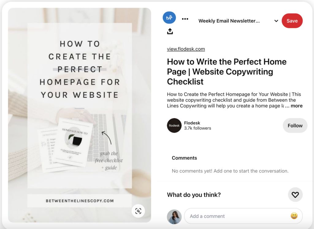
While this isn’t the worst of the worst issues to have, it certainly doesn’t look great.
3. Pinterest users need more information before opting in
Your Pinterest audience is newer to you than your audience on other platforms. While your Instagram followers might be willing to hand over their email address after a few story slides, people who find your lead magnet on Pinterest aren’t as sure yet.
Having a lead magnet landing page on your own website allows you to include more information than a simple opt-in page. That information may be the thing that convinces a Pinterest user to actually subscribe instead of just “x”ing out.
4. Your lead magnet landing page can link to the rest of your website
This is where my recommendations for creating your lead magnet landing page might differ from the typical marketing advice, because I think your opt-in page should absolutely link to other pages on your website!
Following the same reasoning that Pinterest users need more information before subscribing, they might also want to learn more about you by exploring your website. That exploration leads to increased time spent on your website (SEO bonus points) and could even lead to a more qualified, interested lead.
On the other hand, if a user isn’t ready to opt-in just yet, you can direct them to other free resources like your blog to give them a no-barrier taste of your expertise and education style.
5. You can track analytics more accurately
I am far from a metrics expert, but I do know you have a lot more control over the analytics from your own website compared to a third-party landing page. And as far as sorting through those website analytics, when your lead magnet landing page is on your own website, you can more accurately see where the traffic is coming from to get an idea of how Pinterest specifically is converting for you.
How to Optimize Your Lead Magnet Landing Page for Pinterest Conversions
As mentioned, your Pinterest audience needs a bit more convincing before they convert. So if you’re marketing your lead magnet on Pinterest, you need to take your Pinterest audience into consideration when creating your lead magnet landing page.
It isn’t just Pinterest we’re considering here; you can also optimize your landing page for SEO. Generally speaking, you should aim for a minimum of 300 words on any page you want to optimize for Miss Google. So adding extra information benefits you in both Pinterest and SEO channels.
If you want to optimize your landing page to convert more Pinterest users, here’s what you need to include:
Catchy Headline / Page Title
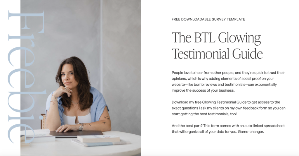
This might be the title of your lead magnet, a call-out of your target audience’s main pain point, or the primary benefit that the lead magnet provides. Ideally, if you’re optimizing for SEO, this headline would be keyword-rich.
Here you can see two different approaches — one that’s just the lead magnet title, and one that’s a bit more benefit- and action-driven

Short Description of the Lead Magnet
If it’s not obvious from the headline, give a little more explanation and detail about the lead magnet. Explain the format it’s in, more about why it’ll actually help your audience solve their need, etc.
Try not to overwhelm them with too much information though. Overpromising (even if the freebie really is that good) will likely make your audience a bit skeptical.
Opt-in Form
This is how your audience is actually going to subscribe to your list and get the lead magnet. Do not skip this one!
You should have at least one opt-in form on your lead magnet landing page, preferably above the “fold” of the website. In other words, the opt-in should be visible without users having to scroll.
You can have more than one spot for users to opt-in on the page, and I typically recommend that you do, especially if you have a longer landing page.
About Section
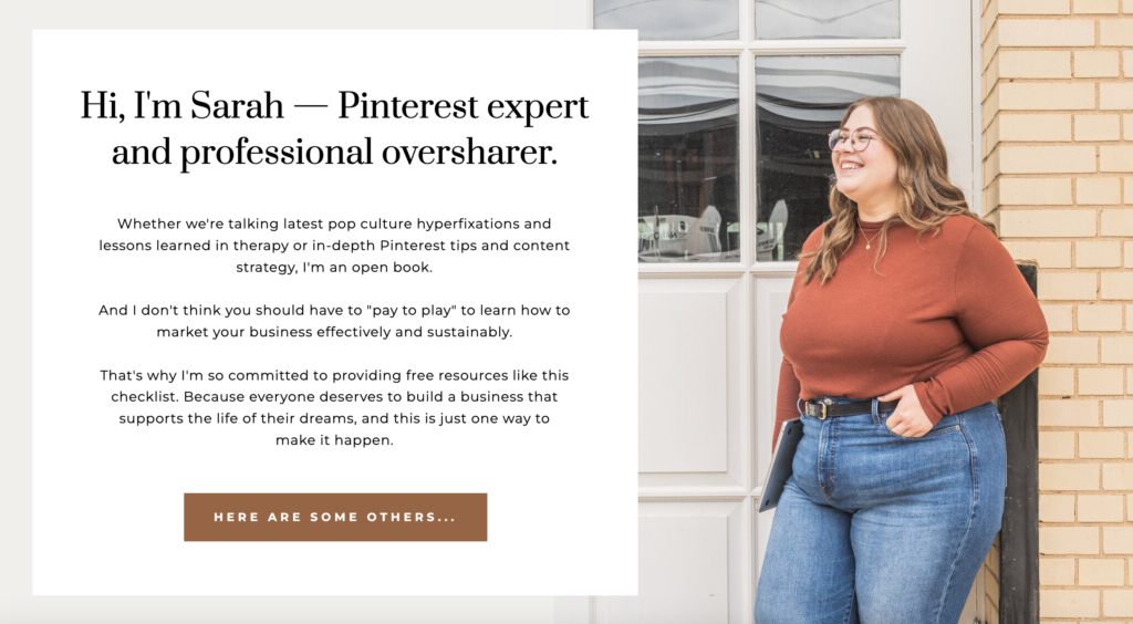
Who the heck are you and what makes you qualified to educate about this subject? This is what readers are going to want to know when they’re considering downloading your lead magnet!
Once again, Pinterest users don’t know you, so they don’t trust that you’re the expert yet. Use this section to give a topic-relevant introduction to what you’re all about.
More Audience Identification
The best website copy, even on landing pages, makes the reader feel like you get them and that they’re in the right place. Particularly if you’re looking to attract a specific type of audience, more copy that speaks directly to them is a good idea.
Heck, you can even include a straight-up “This is for you if” section like Tori Sprankel does here:

Skimmer-Friendly Details
Not everyone wants to read paragraphs of detail about a free lead magnet. If there are any other relevant details of your freebie to share, try to include them in an easy-to-digest format like a table or bullet points.
Mia Giommi does a great job with her lead magnet landing pages. Not only does she include lots of copy identifying and empathizing with her target audience’s current situation, she breaks down exactly what’s included in her free resources super clearly.
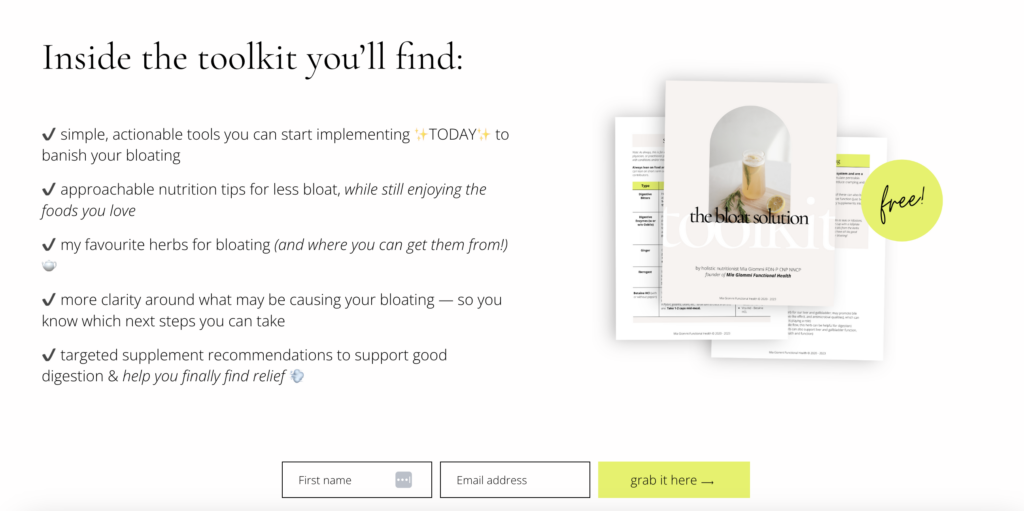
This is also a good example of the next thing I recommend including in your lead magnet landing page…
Lead Magnet Mockup
A picture may tell a thousand words but a mockup sells a thousand times better. JK, that stat is totally made up, BUT a visual representation of your lead magnet is always a good idea.
Whether you’re offering a PDF, Notion template, mini-course, or anything else, having some sort of mockup of what people will get adds visual interest and depth to your lead magnet landing page!
Social Proof
If you’ve had this lead magnet for a while and have gotten good feedback on it, show it off! Social proof adds a level of trust and confidence that will help website visitors feel better about opting in.
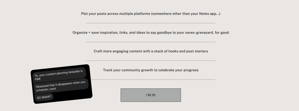
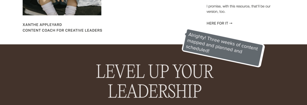
I love how Oh Sierra includes these screenshots of positive reviews from the DMs throughout the page instead of having just one dedicated testimonial/review section.
Other Free / Paid Content
Since you’ve got ‘em here, might as well take the opportunity to direct visitors to your lead magnet landing page to other resources they might be interested in! This could include other freebies, blog posts, products, or even your services. Just make sure they’re still relevant to the topic and intended audience of the lead magnet.
Biiiiig important disclaimer here: you don’t need every single one of these on every single one of your lead magnet landing pages. Pick what makes sense and leave the rest.
What’s most important is making sure you’re clear on:
- What the lead magnet is
- Who can benefit from it
- Why it’s helpful
- How to get it
All the rest is just extra cherries on top.
Lead Magnet Landing Page Examples I Love
I’ve been sharing screenshots of some of my favorite landing pages throughout this little checklist, but if you want to see the full picture, here are the ones I mentioned:
- Between the Lines Copywriting’s Glowing Testimonial Guide
- BTL Copy’s Sample Lead Magnet + Welcome Sequence Framework
- Tori Sprankel’s Say Hello in Stories Challenge
- Mia Giommi’s Bloating Toolkit
- Oh Sierra’s Content Planning Template
Seen a lead magnet landing page recently that rocked your socks? Send it my way!! (Email or IG 😘)
Want to convert more of your Pinterest audience?
Grab the FREE Pinterest Conversion Guide to start seeing results that actually make a difference to your bottom line.
